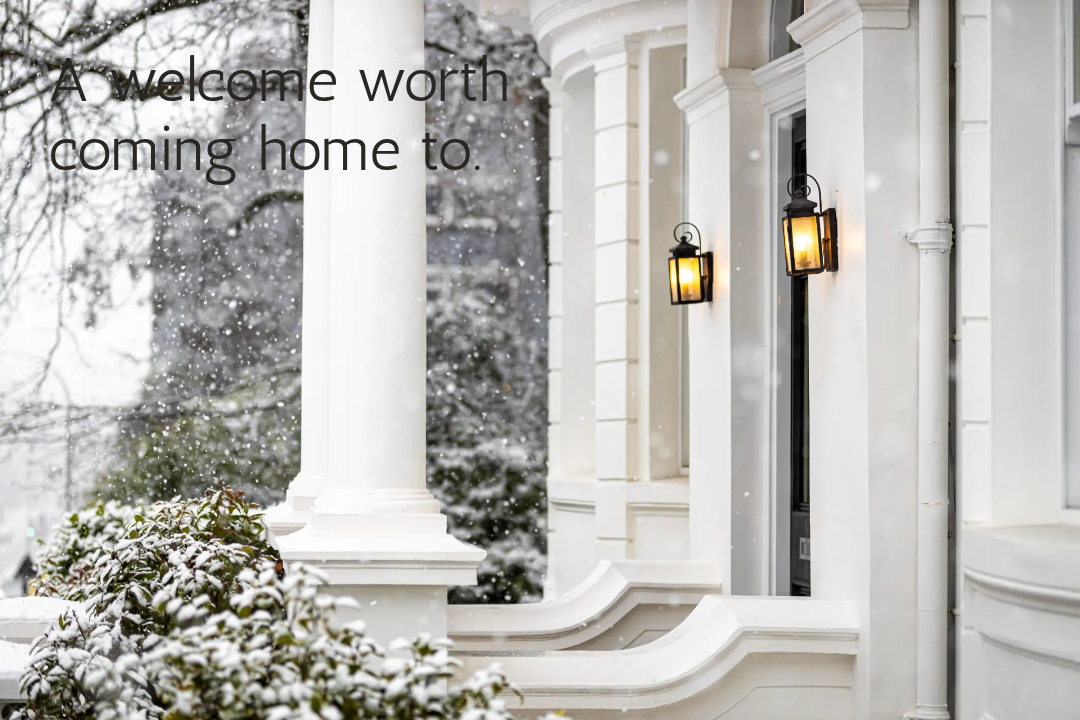
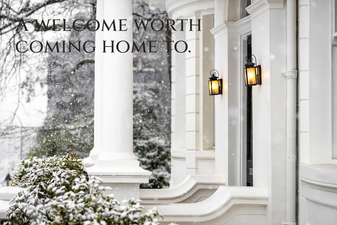
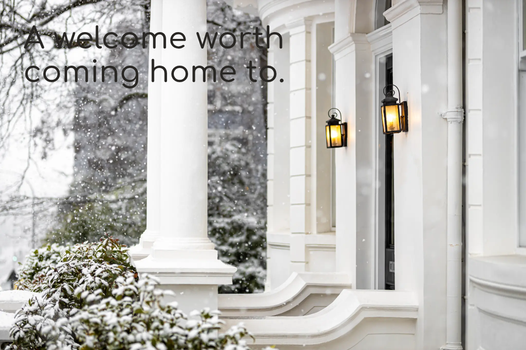
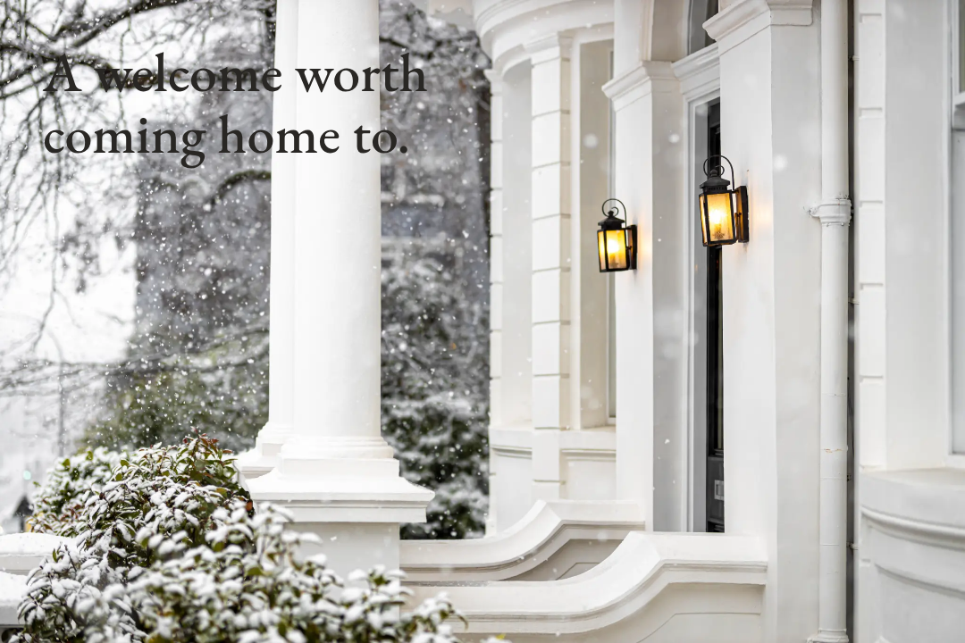
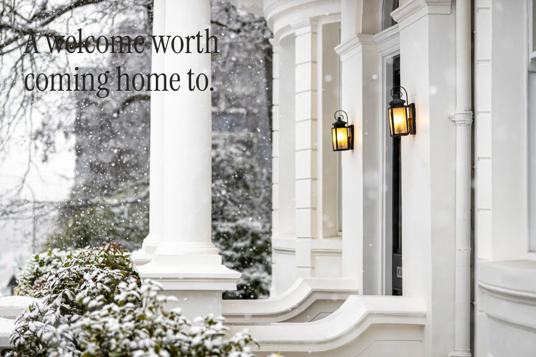
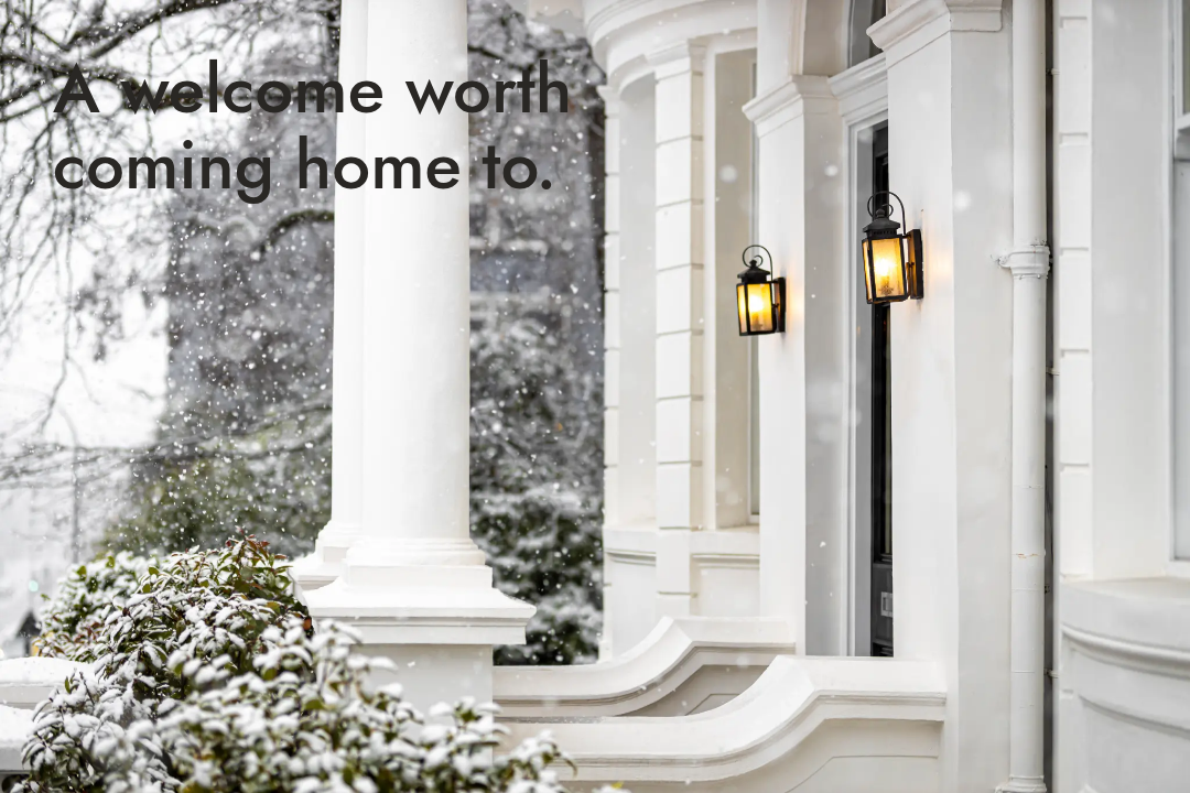
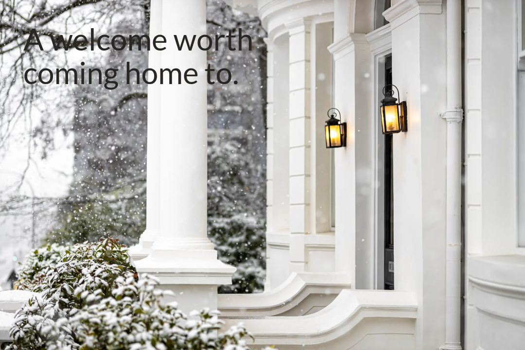
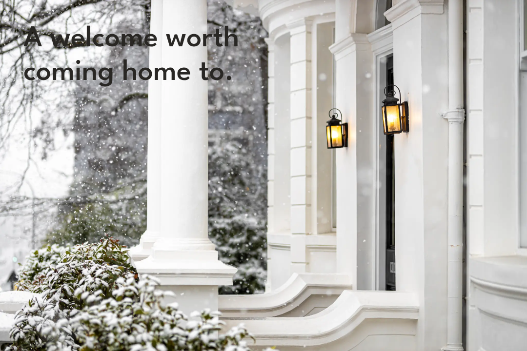
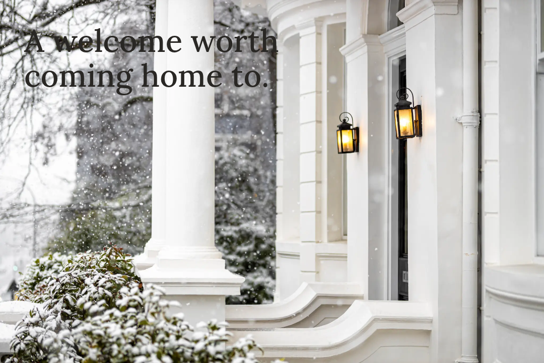
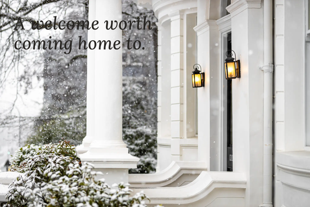
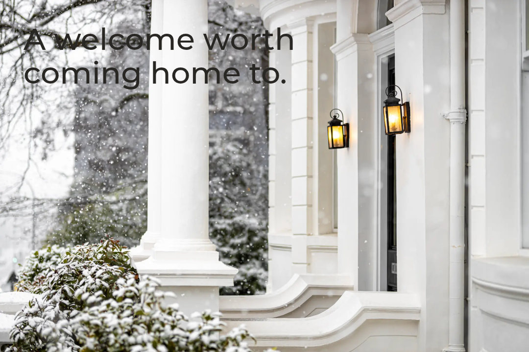
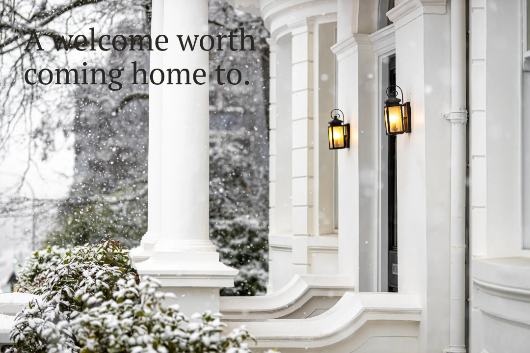
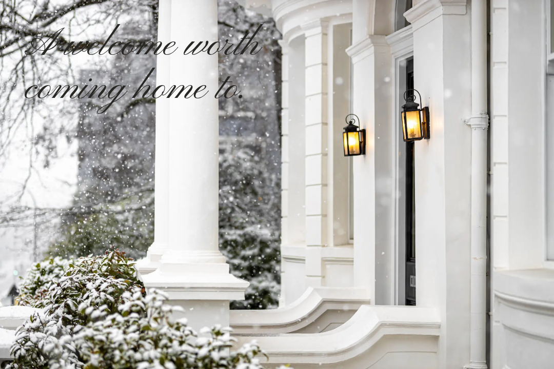
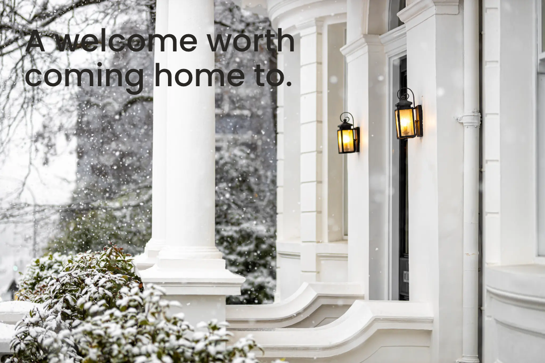
A little type inspiration. A quieter color direction. See how a font feels on a photo before making it part of your brand.
01 / THE FONT EDIT
Find your kind of type.
Each photo example is a static image with the named font and style already on it. The labels and captions use our site typography, not the font being previewed.
15 font styles
Sans serif / Regular
Antic
Airy, softly flared letterforms with an approachable feel.
Pairing ideaPair with Lora for warm editorial contrast.
Initial download requires membership. The ZIP includes the supplied TTF files + license.
We have not confirmed redistribution permission for this font. Please visit its official source to check licensing and availability.
02 / THE NEUTRAL COLOR EDIT
Need brand color ideas for 2027? Six very neutral directions.
Suggested palettes for your next brand refresh—not a trend forecast. Choose a direction that suits your photography, your voice, and the way you want your brand to feel.
KEEP IT READABLE
Use the darkest tone on the lightest background for headlines and body text. Keep lighter tones for backgrounds and accents, not paragraph text. Check contrast in your finished design.
DIRECTION 01
Warm Minimal
Soft cream, linen and quiet warmth.
A direction for A welcoming real estate brand with a relaxed, personal feel.
DIRECTION 02
Modern Greige
Clean stone tones with a grounded finish.
A direction for A polished brand that works with both modern and traditional homes.
DIRECTION 03
Coastal Quiet
Shell, sand and pebble—without the beachy blues.
A direction for An airy lifestyle brand with a calm, understated point of view.
DIRECTION 04
Soft Contrast
Balanced pale grays, finished with deep ink.
A direction for A crisp brand for clear, confident market education and listing content.
DIRECTION 05
Earth & Oat
Ivory and warm, natural brown neutrals.
A direction for An approachable brand with a grounded, home-centered aesthetic.
DIRECTION 06
Editorial Monochrome
Paper white, soft gray and almost-black.
A direction for A minimal editorial brand that lets your photography lead.
These palettes are ideas for your brand. My Content Drop remains charcoal #171717, warm white #F8F7F4, and a little red #CE011F.